



Formula One's pre-season testing began this month for an early glimpse into the sport's imminent future. There is a lot to be excited about in F1 for the upcoming season, with a raft of changes.
New regulations have transformed plenty inside and outside the cars, attracting new manufacturers, including an entirely new American team, Cadillac. There's a new driver in Arvid Lindblad, and the returning names of Valtteri Bottas and Sergio Perez. And let's not forget a new reigning champion, Lando Norris.
As such, that first day of official pre-season testing in Bahrain had the F1 fandom desperate for updates. There was the thrill of seeing the adjustable aerodynamics that replace DRS working for the first time. The new engines’ noises even had the F1 YouTube channel share a commentary-free video, letting us revel in the audio. Plus, we got to see all 11 teams in action after Williams were concerningly absent from the earlier shakedown in Barcelona.
Nonetheless, a sense of familiarity soon arrived as more footage landed. Yes, these are new cars, a new driver, and an all-new team, but one thing hasn't evolved much in 2026: the liveries. Aside from the new teams, fans who haven't tuned in since the Abu Dhabi finale won't be lost with how similar many liveries are to 2025. But closer inspection reveals some tweaks in the established rainbow of color, and lets us decide which F1 team looks the best heading into the season.
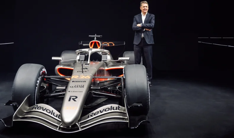
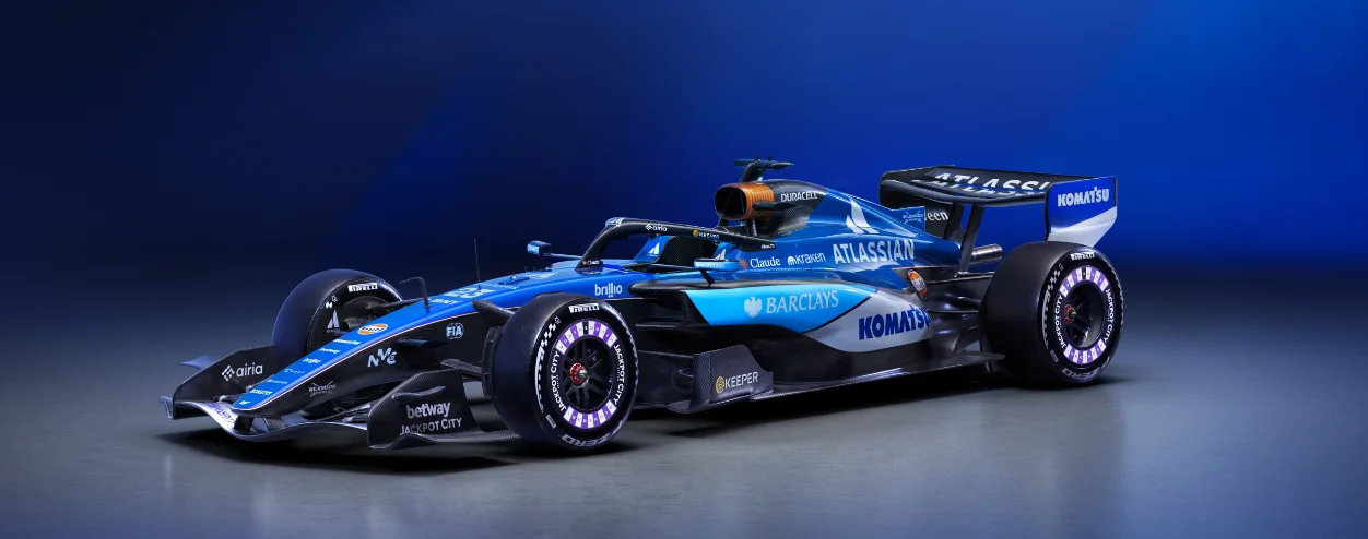
11 - Williams
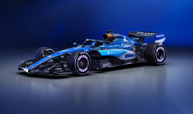
The British team made great strides in performance last year. James Vowles' leadership has turned what was a sinking ship into a competitive podium-winning operation. And by doing so, he’s attracted sponsors. That income should see the nine-time champions be financially secure for years.

Sadly, from an aesthetic standpoint, the influx of sponsors has not created a coherent paint job. The team's traditional navy-blue clashes with the sky blue of a banking backer to the detriment of the entire livery. Combined with the purple-white wheel covers of a gambling website, there are too many competing ideas here. At least the battery airbox cover remains.
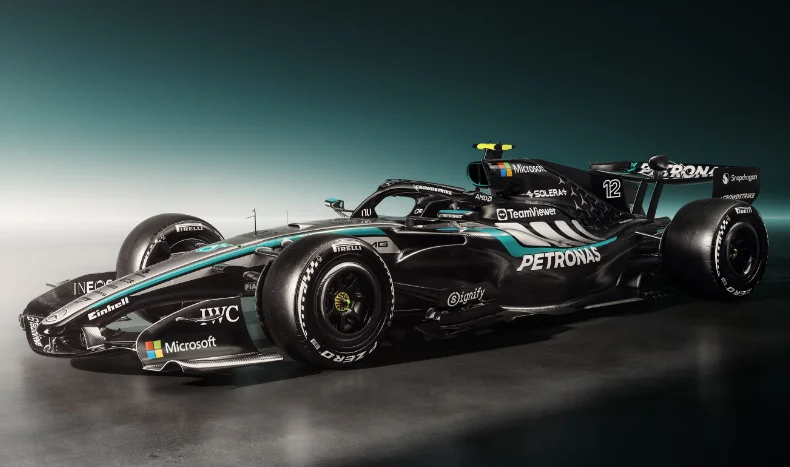
10 - Mercedes
Switching from silver to black was a bold choice for Mercedes. That 2020 move went hand in hand with raising racism awareness and was spearheaded by Lewis Hamilton. Hamilton is now gone, yet some of the black livery elements stick around, forming a half-and-half design that doesn't quite know what it wants to be.

There is much less silver than 2025's challenger, although enough to recognize this livery as a Silver Arrow. Yet the blocky transition, for want of a better word, over the sidepods and lower engine cover looks like it’s missing something. It doesn't help that these elements evoke thoughts of closed airplane windows, either. A commitment to either fully silver or fully black would've been a better move.
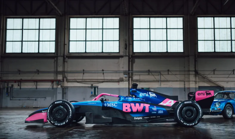
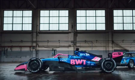
9 - Alpine
Barely a change from their recent liveries has Alpine back with the pink and blue formula. With their switch away from their own Renault engines to Mercedes, there was a small hope that a switch of colors would follow. It makes sense that the team name remaining as Alpine means their blue branding remains, though.

There's a right way to put pink on a livery, and Force India did so for years. Alpine's pink integration just doesn't sit as well as it could, and it never has. Sadly, 2026 is no exception. Perhaps Franco Colapinto’s supermarket sponsor can bring some interesting yellow to the car later this year. Blue and yellow, after all, did bring Renault success in the ‘00s.
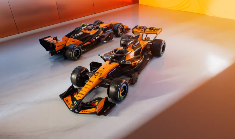
8 - McLaren
Victors of both championships or not, McLaren suffers from Williams’ messy sponsorship problem, too. Although they've had more years under Zak Brown's stewardship in attracting high-profile names to finesse their design than Williams have, it's still not amazing.

You can see hints of the fan favorite red-and-white design from the '80s and '90s, but it doesn't stand out as much in orange and black. The two shades go well together, but the black always feels aimless and lost at the rear. The Woking outfit does seem to have found success since sticking to this livery design, though, so maybe they're onto something.
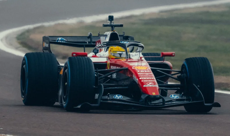
7 - Ferrari
No points for guessing that it's a scarlet red livery at Ferrari, of course. And there are also no points for pointing out how bad those blue sponsor circles are all over the car. If there has ever been an argument against listening to brand guidelines, the Ferraris of the mid 2020s are just that.

The white around the cockpit is more reminiscent of Niki Lauda's car from the '70s than their tribute livery from Monza last year. It's unfortunate that those blue fots detract from it on the engine cover, however. It's not Ferrari's worst livery, but it won't be remembered as their best.
6 - Audi
With more silver than the Silver Arrows themselves, Mercedes' new German rivals have the cleanest livery of the grid. It's a no-nonsense attitude, and very similar to the teaser concept from November last year. Whether or not that's a positive will depend on whether you enjoy minimalism.

That orange-red accent will look different to everyone, thanks to TV’s various color profiles. Night racing will alter it further, too. Your best bet is to see it in person to judge with your own eyes. This is no iconic look for a new team, but it's far better than the garish green of last year's Sauber.
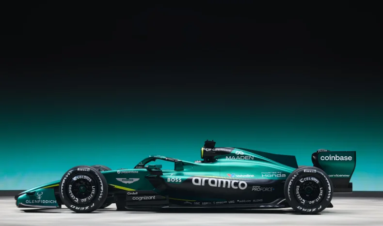
5 - Aston Martin
While McLaren and Mercedes haven't worked black nicely into their designs, Aston Martin very much have. The darker shades are well-placed among the green to strengthen the primary color here. It's a simple enough design, and that fluorescent pinstripe adds the pop of brightness where needed.

British Racing Green liveries should always scream elegance and class, and the Silverstone-based team ticks the boxes for both here. James Bond doesn't need another Aston Martin to add to his collection, but if he did...
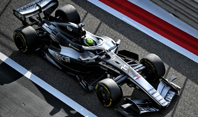
4 - Cadillac
F1 fans of a certain age will recall that BAR's debut livery was intended to be blue for one driver and white for another. Rules dictated that choice wasn't permissible, so we welcomed a dual livery – blue on one side and white on the other. Cadillac haven't quite gone down that route, but an asymmetrical look is always a treat.

While a monochrome look isn't overly exciting, choosing to mix the two as they have is a bold choice. And here's a bold prediction to go with that... They won't have this look for 2027 after they lure in some sponsors. Enjoy it while it lasts.
3 - Racing Bulls
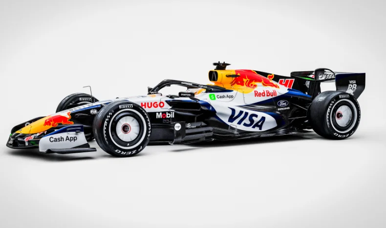
We're years away from the glorious AlphaTauri liveries, but this is a good entry from Red Bull's baby brother. It's certainly not an all-timer, but it looks like how a Formula One car should. There's enough blue on it for this to not feel like a white car, although it very much is, with a terrific balance of Red Bull's yellow and red, too.

Those colorful charging bulls aren't something the AlphaTauri had to deal with in its color schemes, which aided their hyper clean looks. Here at Racing Bulls, they add something rather playful to what is otherwise a simplistic livery. For what Racing Bulls should represent, AKA a fun young team, that's a huge plus.
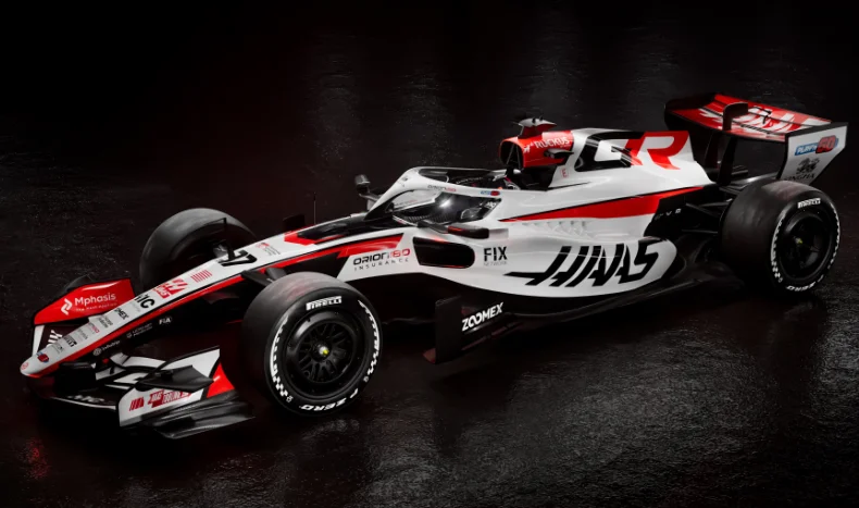
2 - Haas
Similar to their midfield rival at Racing Bulls, Haas' primarily white appearance just looks like an F1 car. They've opted for their usual red rather than blue, of course, and it forms a tidier version of Racing Bulls’ look. The partnership with Toyota has formed a very popular livery with fans.

Haas' cars have never been massively exciting to look at. Grey was never going to be sexy; they couldn't match Mercedes' sleek black look, and let's not talk about that Russian-flag car of 2021. Finally, they've got something to be proud of.
1 - Red Bull
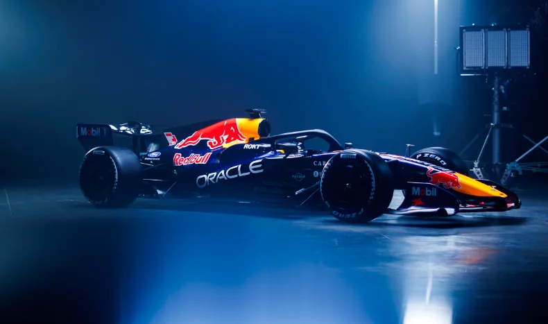
It's a surprise winner for 2026, with Red Bull mostly sticking to what they know again. They never reinvent the wheel, and as long as the energy drinks keep selling, I doubt there'll be much cause to drastically alter the core livery. And yet there's something simultaneously nostalgic and fresh with this 2026 look.

Blue on a Red Bull is not something new. You may recall that Sebastian Vettel's first titles were with a mostly blue hue. That morphed into a gloss purple with their Renault partnership, and then turned to a matte navy, so dark it was almost black, with the Honda engines. Ford's badge color, it seems, has inspired the 2026 look. That ‘Ford blue’ combining with full midnight black, plus the inevitable yellow and red of the team's logo, sees Red Bull's art designers win the most eye-catching livery for this year.

View the article image gallery